

Your website is the critical ‘first impression’ that can inspire people to schedule a visit, or pass and try the next place down the street.
The most successful apartment management companies out there know this better than anyone.
It’s why 80% of marketers are increasing their digital marketing budgets to stay ahead of the competition, specifically in key areas like social media marketing and content marketing.
But even with all the money in the world, websites still tend to underperform.
What makes top apartment management companies different?
They’re eager to test new ideas.
Similar to the 90% of successful businesses, the top management companies have a designated innovation budget designed to uncover, test and study what works and what doesn't.
Everything from marketing analytics to real-time social listening tools, the top performers are focused on keeping up with the constant evolution of today's digital landscape.
That static, ‘brochure’-style apartment website just isn’t going to cut it anymore.
But you don’t need to have an innovation budget to know what’s working and what isn’t when it comes to apartment websites.
Instead, start looking at incorporating these 9 multifamily website features used by the top apartment management companies to keep you ahead of the competition and getting renters in the door.
In a world where 47% of Americans use Facebook as the primary influencer of purchases, your website is the place to attract, build trust, and generate prospects that lead to quality leases.
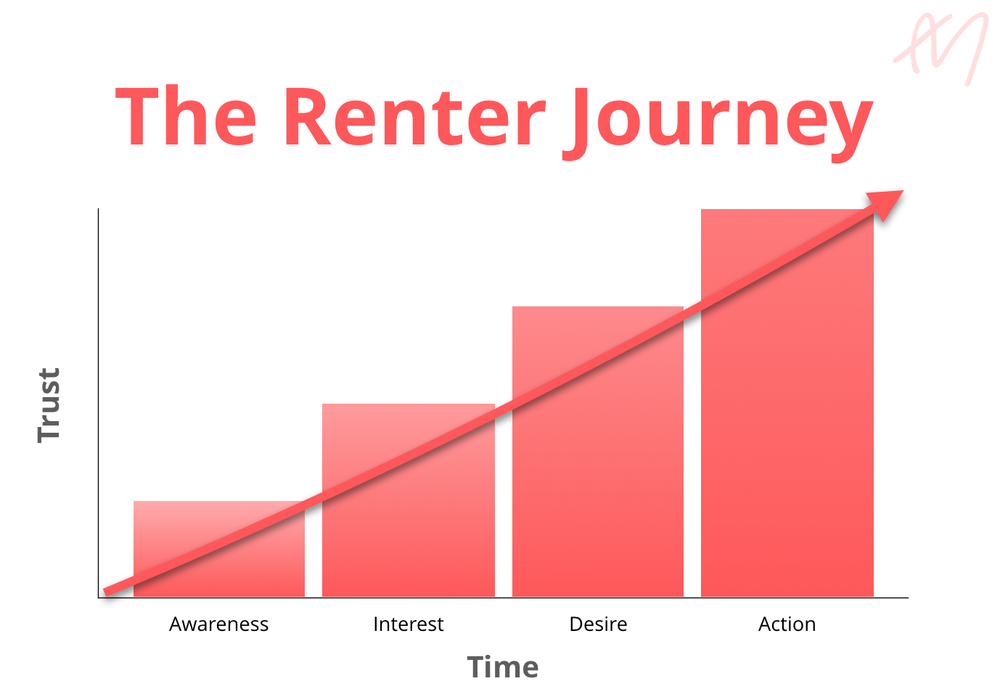
When it comes to getting the most out of your website, the top apartment management companies all understand one fundamental quality of renters and consumers alike.
The process of making a buying decision is exactly that; a process.
We call this the renter journey.
Consider that even the best landing pages convert around 10% of visitors, meaning the vast majority of people coming to your site will not turn into a customer.
Yet, that doesn’t mean that your website isn’t doing it’s job in nurturing the prospect and providing information that will influence their buying decision over time.
To do this, you need to get them to revisit multiple times, as more than half of all customer interactions happen during these multi-event, multi-channel journeys.
The silver lining is that if you can do it correctly, it will prove extremely profitable. Inbound leads have a close rate of 14.6%, compared with the dismal ‘outbound’ rate of 1.7%.
The best websites are designed with the ‘Renters Journey’ in mind using specific tactics and features to help appeal to website visitors at each stage of the journey by being magnetic and attracting visitors rather than talking at their audience.
At the very beginning, people aren’t even aware that they have a need for what you offer yet. They might be browsing around related topics of interest, but aren’t actively looking for a new place to live. Typically, some event in their life will trigger that need awareness and cause them to start searching for available options. They might arrive at your site through a content-driven page around these topics, not necessarily searching for your property by name just yet.
Also known as the research phase, their search process is vague and generic. But as they become more familiar with the possibilities, they’ll begin narrowing their target list down based on obvious factors like Amenities, Photo Galleries, and property type.
Now the prospect begins narrowing their list down based on specific elements they can or can’t live without. They know which neighborhood or streets are ideal for them, and they’ll have a shortlist of properties to thoroughly research prior to visiting, including site and unit Walkthroughs or Floor plans which help transport them into their potential new digs.
Prospective renters are in the ‘bottom of the funnel’ when they start going through your availability and pricing pages to determine how the unit mix fits with their budget, needs, wants, etc.
They’ll also start looking around the Appointment and Contact pages as well to start the process for beginning with an on-site visit.
The best property websites incorporate different features and specific types of content to cater to visitors in each grouping. Here are 9 of the most essential that your site needs (or needs to upgrade) to generate more leases.
Content marketing is the foundation or ‘hub’ of all inbound marketing activities, blogging being one of the biggest.
In fact, according to a MarketingSherpa study, companies who blog effectively can see a 2,000% blog traffic increase and a 40% revenue increase.
One of the reasons is because they’re the perfect location for publishing ‘unbranded’ content, which features helpful topics of interest all unrelated to your own property specifically (hence the name).
Why? SEO primarily.
86% of people go to search engines when they want to learn something. That means creating ‘unbranded’ helpful content around topics like furniture, design, and events all happening around your location are the perfect way to bring in new people.
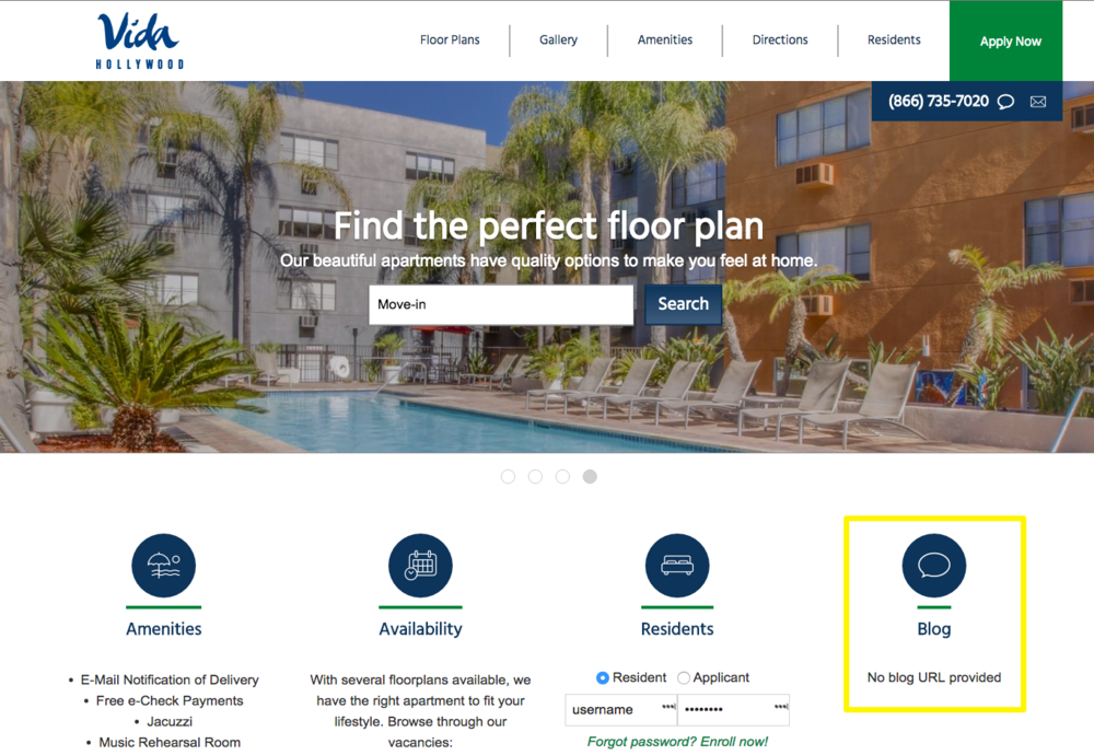
But only if you execute. For example, the Vida Hollywood has a location for their blog on their site… but URL link. Whoops!
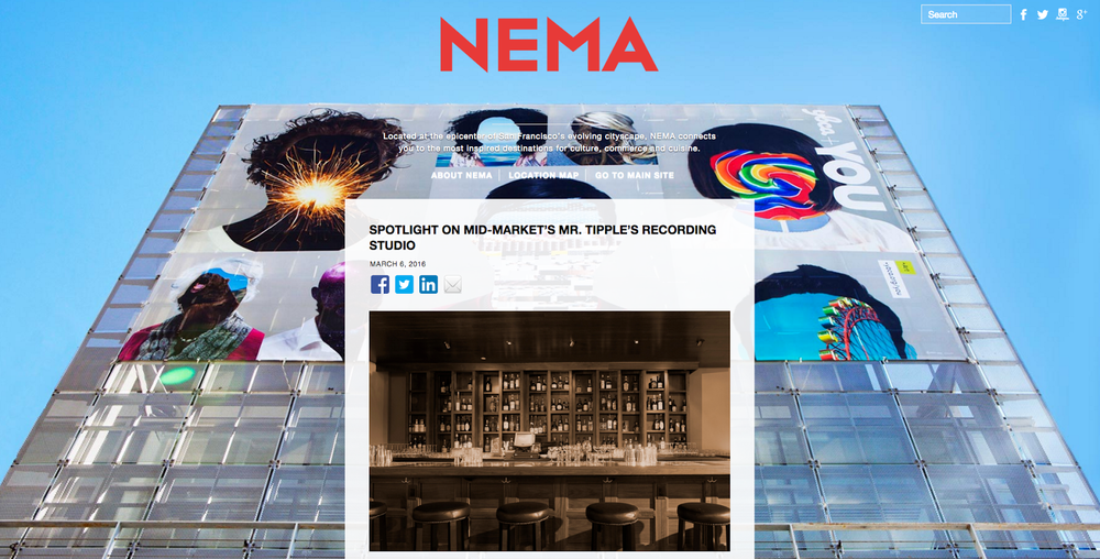
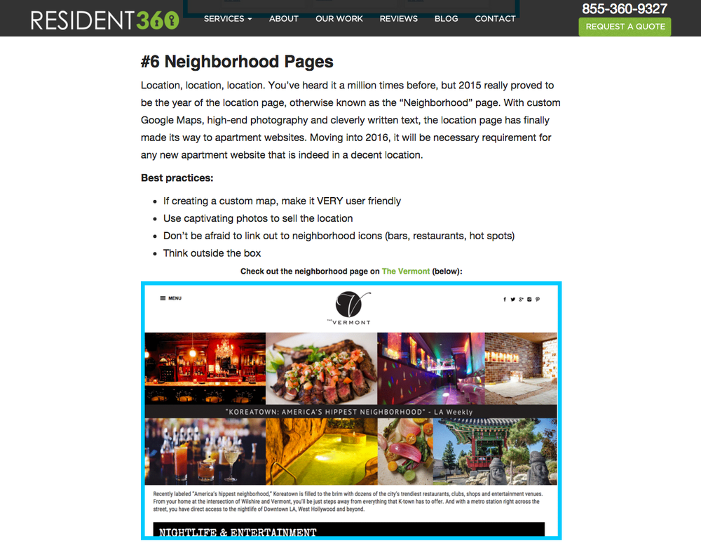
In contrast, Crescent Heights executes flawlessly with the NEMA in San Francisco, which publishes high-quality posts about what’s going on in the surrounding area. For example, they’ll highlight fun events each month. And they’ll also shine the spotlight on cool places that make their location so unique, like a local recording studio.
Another form of leveraging ‘unbranded’ content is by focusing on the proximity of important things around your property’s location.
Bozzuto does this well with the Deco in Boston by providing an interactive feature where visitors can select different categories and see the proximity of each.
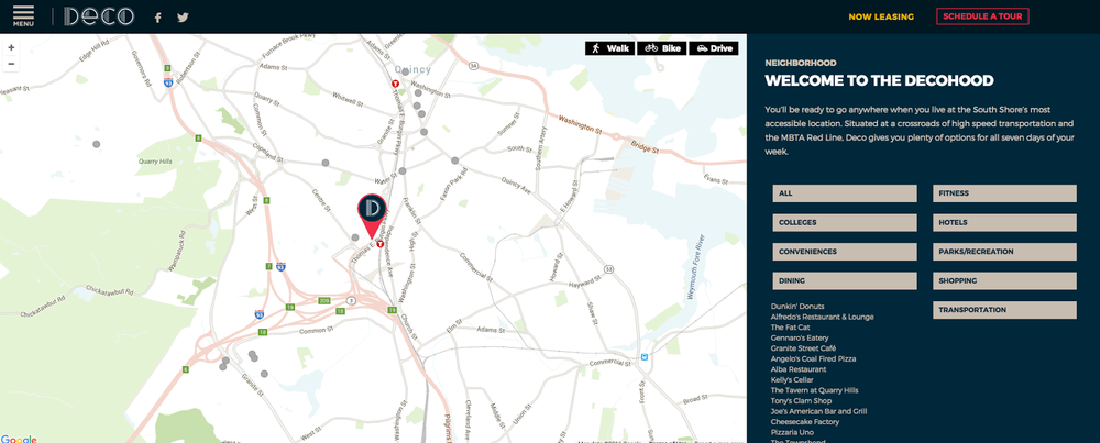
You can also customize these based on your clientele. For example, there’s no schools listed in any of these drop downs. While that’s fine if your renter’s are urban professionals and not families. However otherwise, this is a massive ‘gap’ in understanding what drives your prospective tenant’s decision making.
This example is part of a larger focus on incorporating neighborhood pages that tell a story about your property’s surrounding area. Neighborhood pages give you the ability to ‘sell’ the complete living experience, and compete on value as opposed to just an individual unit (and it’s pricing). Individual units aren’t going to differ dramatically from property to property in the surrounding area. But highlighting the living experience gives you another way to differentiate your property and escape price competition.
The best way to build interest in your property is to show - not tell! - the benefits.
78% of marketers say they try to differentiate through customer experience, and when it comes to property sites, there’s no better way than stunning photography or compelling videos that immediately set yourself apart.
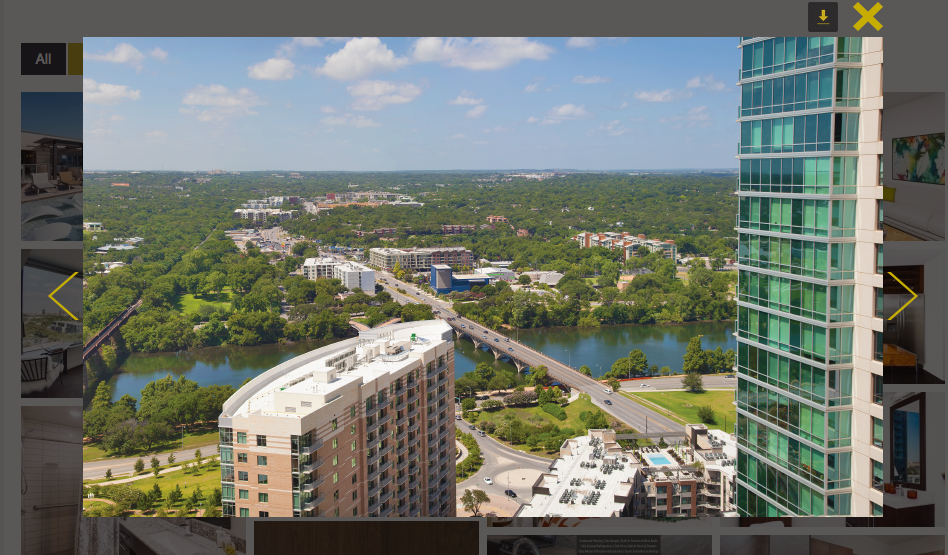
For example, The Bowie in Austin (from Endeavor and Lynd) goes beyond the standard photo gallery by also showing an often-missing ingredient: the actual views from the apartment! This helps people see exactly what they’d be getting, and a small sample of the experience they might be able to attain.
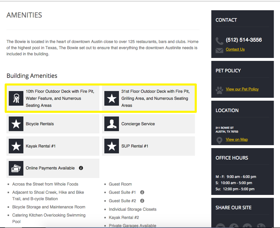
Another place to differentiate your property is through the Amenities, which again should be highlighted in detail with visuals.
The Bowie falls a bit short here by talking about their outdoor decks on the 10th and 31st floors, but then never actually linking out to those details, and failing to use imagery to convey what those spaces look like. That makes it difficult for visitors to grasp the full value of each amenity.
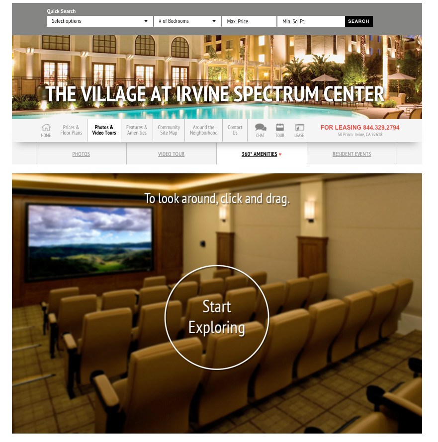
However, one property that gets this part right is the Village at the Irvine Spectrum (from the Irvine Company), which uses a compelling 360° virtual tour to help people visualize themselves in that space. Incorporating interactive technology like this can immediately trump the competition who merely explains without showing.
Photography and virtual walkthroughs are a great place to start differentiating your property in the marketplace.
But you can take the next step by incorporating video, because 60% of people will watch that before reading any text on your site!
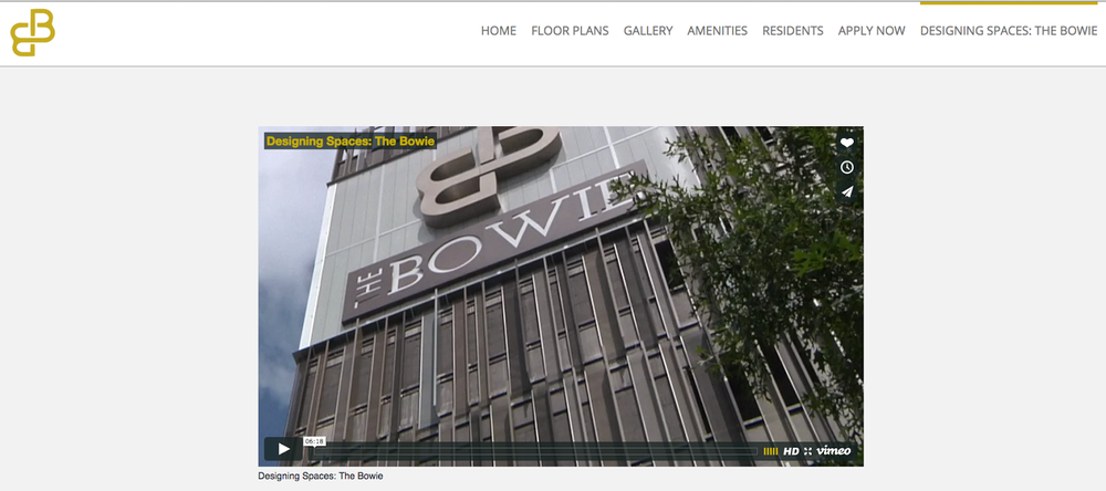
Here, The Bowie excels. Their feature on HGTV’s Designing Spaces does all the selling for them.
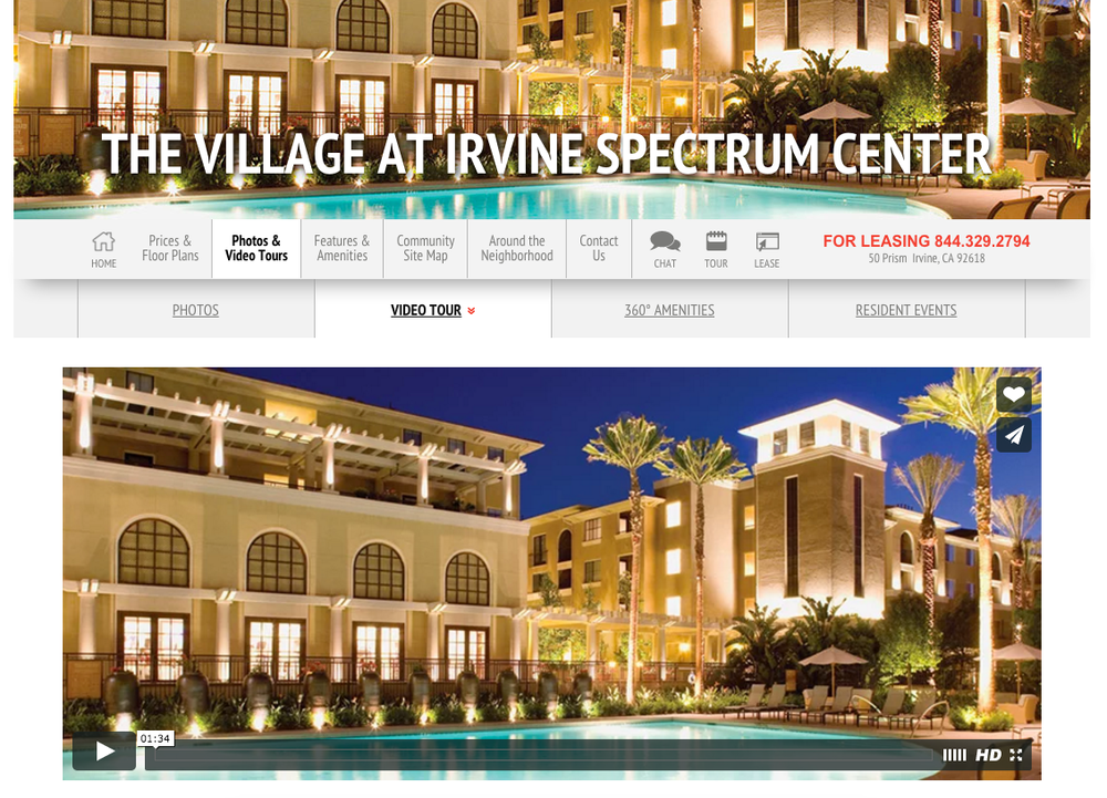
The Village also uses video to highlight their location, amenities, and superior floor plans for their location.
Quality videos are expensive and difficult to pull off, but they also give the property owner a distinct advantage that can position you among the cream of the crop (and the ones who charge premium rents).
Once people are aware of your property and begin developing some interest by flipping through your photos, browsing your amenities, and watching your videos, they’ll begin digging deeper into your offerings.
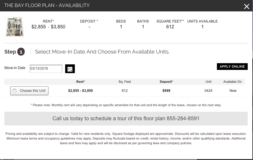
To start, that includes your unit mix with floorplans to get a feel for what fits their need and what their space might look like.
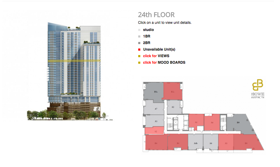
Again, The Bowie capitalizes on interactive technology to help show prospective renters what they’re in store for. You can click on a floor, immediately see which units are available (and where those are in relation to the rest of the building). You can even see the Views and Mood Boards for these particular units on these specific floors, to help understand why their pricing might be different from other floors.
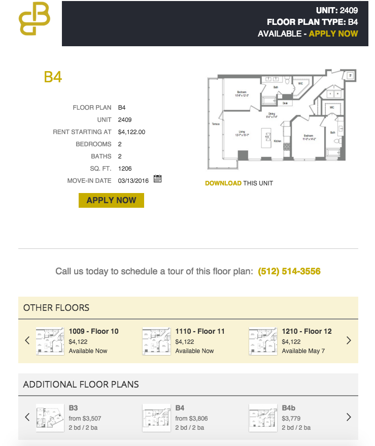
When you select a unit, you can get a detailed view along with move-in date details. If this particular unit doesn’t work for you, or if you’re still just browsing around, they make it easy tostay on their website with two scrolling units on the bottom featuring units on Other Floors, or Additional Floor Plans.
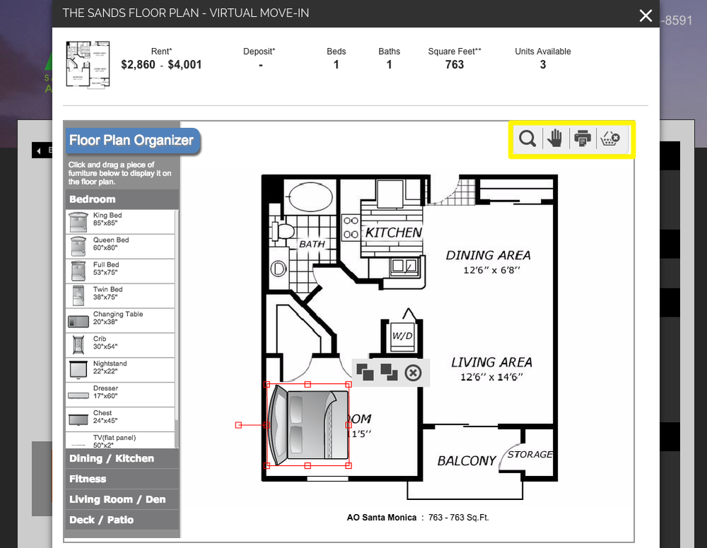
Greystar’s AO in Santa Monica takes the virtual floor plan a step further, providing an interactive organizer where you can drag and drop furniture (with correct dimensions!) to help you figure out how your belongings might fit this unit, and again transport you into the space to drive up desire.
Only when you check the ‘Desire’ box on a prospect’s list will they start browsing current inventory and availability.
This is the crucial step before arranging a visit or lease, so it’s critical that your site can keep them around and convince them to take a chance.
The Village does that through showing a detailed view of all available unit numbers that match the particular layout a prospect’s interested in. They’ll also provide up-to-date pricing information, move-in ready dates, and specific unit features to remove any barriers and make choosing easier.
From this page you can also get a 3D floorplan, so you can assess what a move-in ready place might look like.
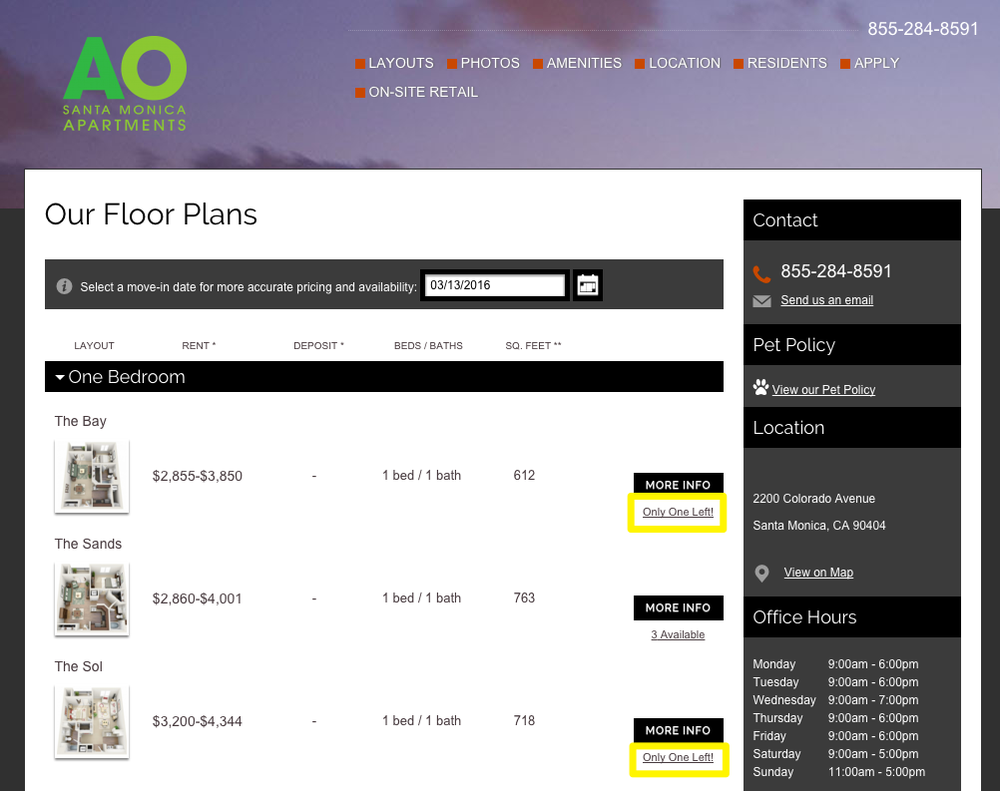
The AO in Santa Monica incorporates another interesting twist, highlighting their limited availability to leverage the power of scarcity and urgency on their list of unit availability. That little trick can be highly influential, motivating those on-the-fence to get moving or risk losing their desired unit.
When you click on the unit to get more information, the pop-up opens with details on pricing including the deposit, as well as the ability to simply select a unit to begin the leasing process. Removing steps or ‘friction’ in the process like this not only makes this less time consuming, but can also increase conversions by 76% as well.
When it’s time to take action, visitors will take the next step by setting up a reservation or visiting your Contact pages to plan on driving by at their earliest convenience (making those visitors hard to track).
Ideally, your website should specialize in lead generation with a contact form that gets these visitors to setup an appointment in a simple, enjoyable way.
A perfect example of that comes from Bozzuto's 'Schedule a Tour' tool, giving the user a simple way to schedule a tour.
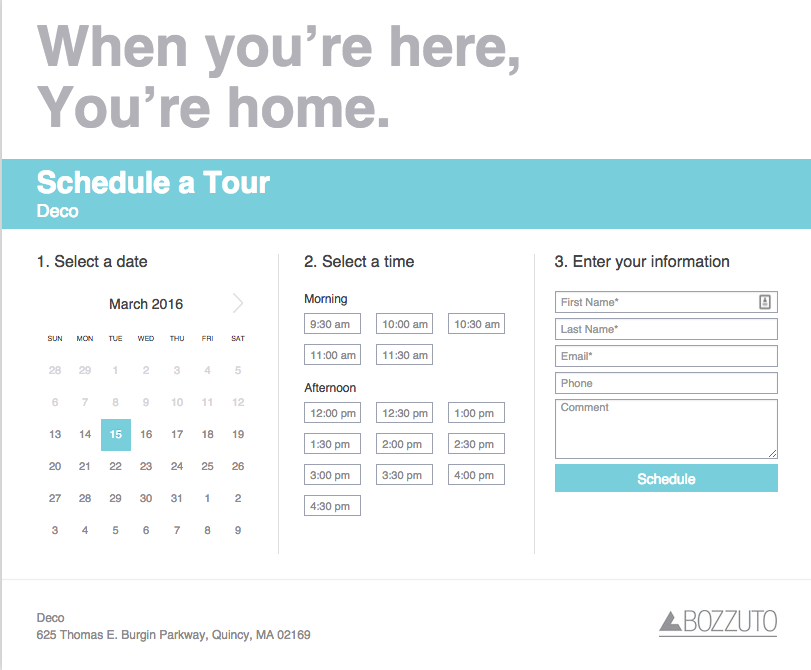
The key is to not make people think, be confused, or overwhelmed with what they’re signing up for (or what they have to fill out). The Deco excels here by splitting the decision into three simple groups (i.e. Select a date, Select a Time, and Enter Your Information), while also limiting or minimizing the questions being asked of a user.
Now contrast that with the primary call to action from The Bowie, which is to apply online. While that’s not necessarily a bad idea, their execution lets them down by requiring users to create an account by filling out a detailed form. That extra ‘friction’ as we learned earlier, reduces conversions.
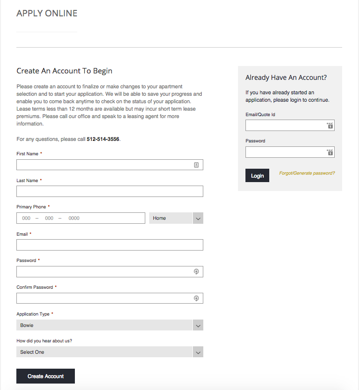
Remember, at this point people are just looking for a tryout still. The majority are not ready to sign on the dotted line, and the act of creating an account (while seemingly small), is a big commitment for people who’re multitasking online or trying to fill out this form on a tiny mobile screen.
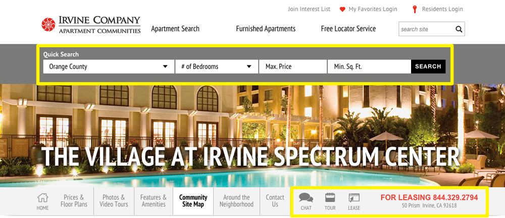
The Village does something interesting, giving visitors a few different options (for different levels of commitment) to take action through chatting, scheduling a tour, filling out a lease, or calling in. They also include a Quick Search feature for those who aren’t yet convinced and still want to look around at their other properties.
Google’s mobile-friendly update (nicknamed Mobilegeddon) last year put mobile responsiveness front and center for many marketers.
The reason is because mobile usage has outpaced desktop for the first time in history, with zero evidence of slowing down anytime soon.
Their mobile-friendly update was designed to encourage site owners to upgrade their sites for this onslaught of new mobile users, giving preferential ranking treatment to those providing the best mobile experiences.
Fortunately, Google also came out with a helpful testing tool to help you analyze your performance.
For example, Greystar’s AO in Santa Monica didn’t fare very well:
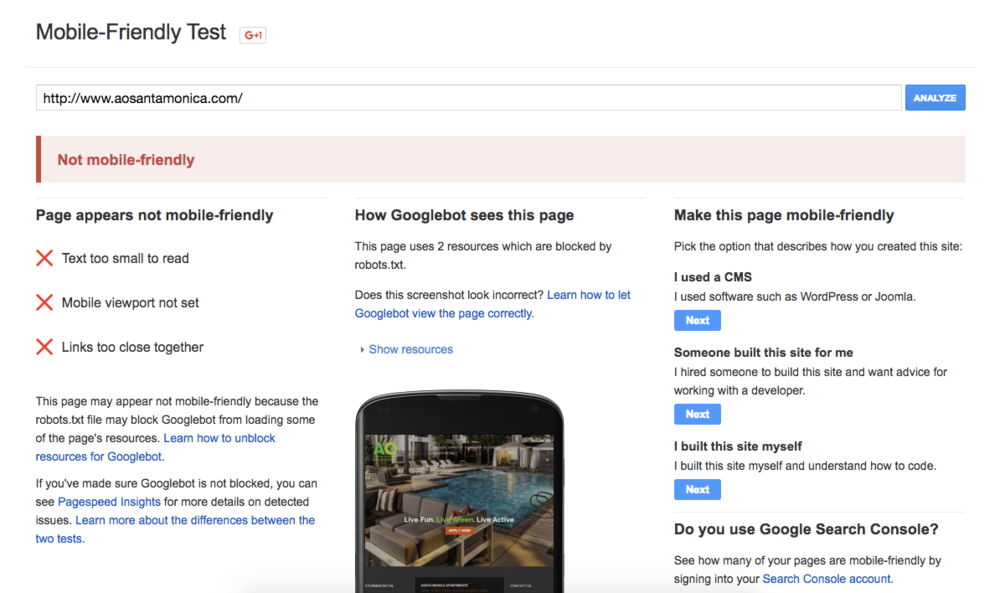
And if we zoom into the mobile friendly preview, you can see why:
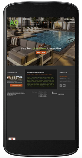
The text is too small, which forces users to zoom in and out, or scroll left to right just to read what the page says. And the links are too close together, making it difficult to use your thumb or finger to make selections.
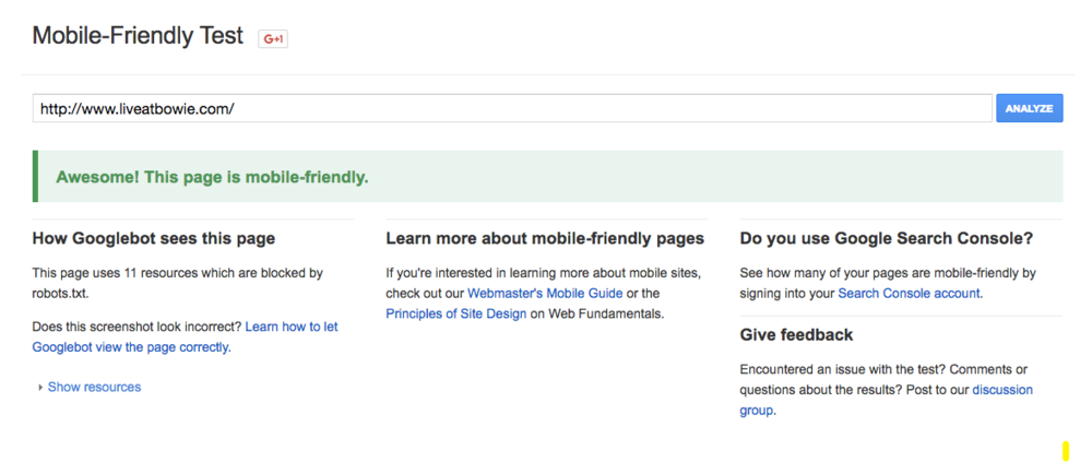
Now contrast that to The Bowie, which passes with flying colors.
Using a handy little tool called the Responsinator, we can view the site in a few different devices to preview our user’s experience and make sure everything looks good.
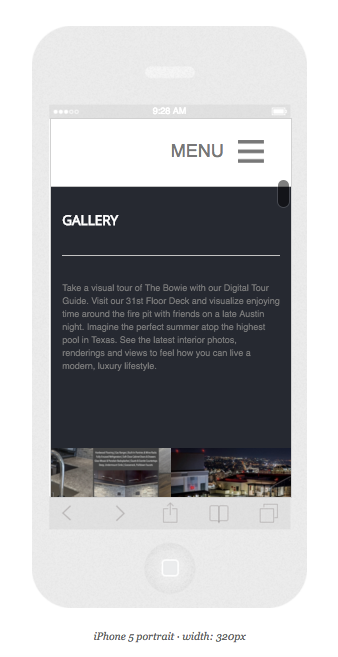
Mobile friendly sites, like The Bowie, are built on a ‘grid’-like system so that all of the page elements can easily expand and contract as needed. That means some elements are relocated others (like the photo gallery under the opening header and paragraph). Other design elements are used, like collapsable menus, to help users easily make selections.
Everything today starts online. Everything. A reported 93% of online experiences begin with a search engine!
That means people are jumping online to do their initial research before giving you a ring or stopping by your location.
These ‘multi-step’ customer journeys are common, with at least half of all customer interactions resembling this multi-event, multi-channel customer journey (according to McKinsey & Company).
Basic analytics services like Google Analytics or Facebook pixels can give you some good data to start with.
For example, they can clue you into how many ‘clicks’ or ‘visits’ are coming from each channel to gauge how your efforts are delivering results.
However, there are other tools which can provide a more accurate view of the entire renter’s journey, from beginning (initial contact) to end (closed lead in your CRM).
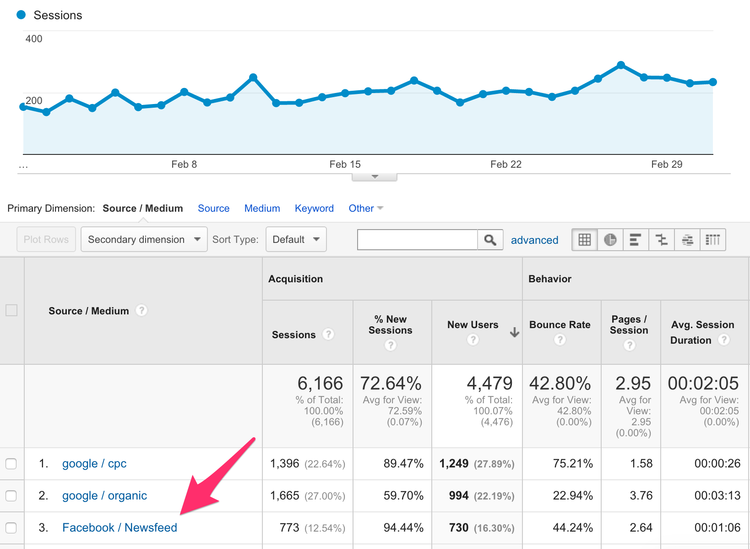
For example, 70% of calls now come from digital channels according to Invoca. Someone might make a general search, and then find your phone number on an advertisement (like the one below).
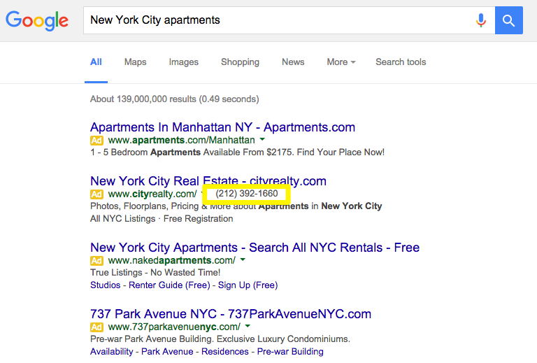
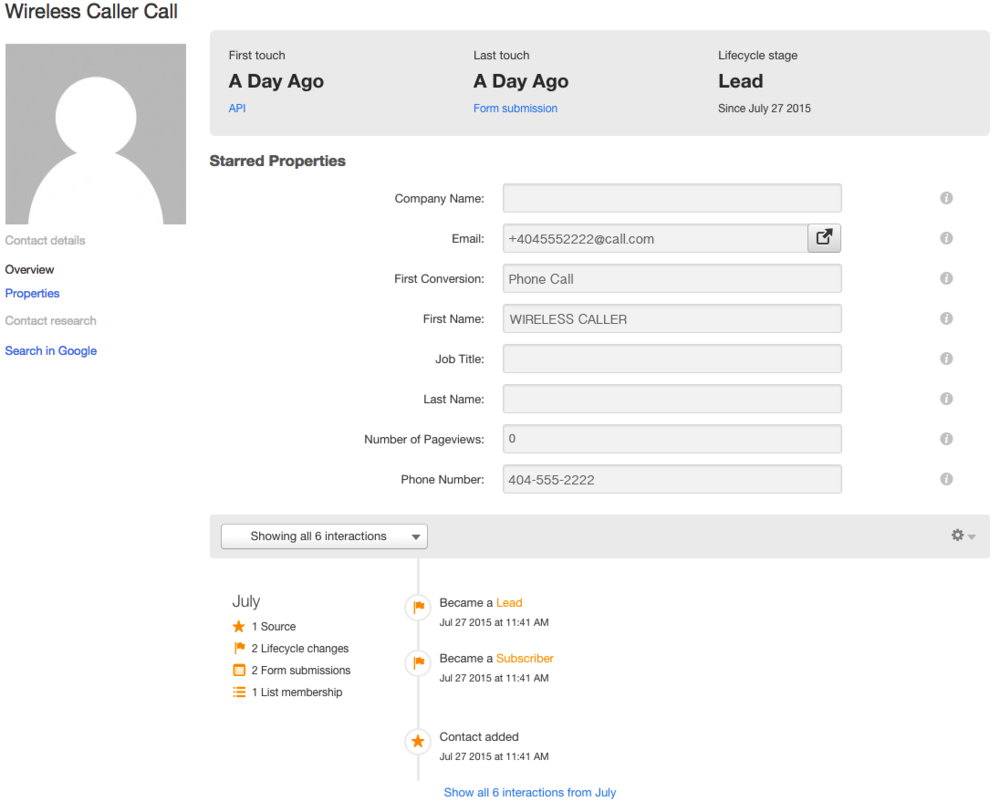
Using tools like CallRail, you can assign different phone numbers to different advertisements, so that you’ll know exactly where people are finding you.
Another example is from Macklowe Properties’ 737 Park Avenue in New York City. They have Sotheby’s taking care of leasing, with several different people’s phone numbers listed on their site.
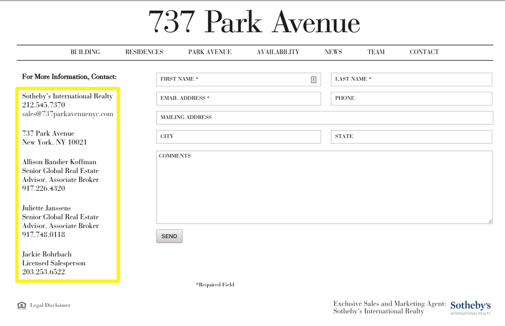
Again, you can set-up unique phone numbers to know exactly where people are calling you from. Then you can take the next step and integrate tools like CallRail with HubSpot (and then even Salesforce) giving you an entire view of not only where new leads are coming from, but new renters. Then you can measure that revenue performance by channel to improve.
It’s rare that a single feature proves universal effectiveness, but that’s exactly the influence Reviews and Testimonials have on purchases. For example:
They’re an excellent form of social proof that indicates if the vast majority of other people like something, you probably will too.
The 315 on A in Boston from Equity Apartments seamlessly incorporates property reviews into their website with a well-designed call-out on the homepage.
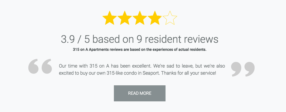
You can also dive deeper and explore the entire list of reviews if you’re in that critical ‘trust-building’ phase of analysis.
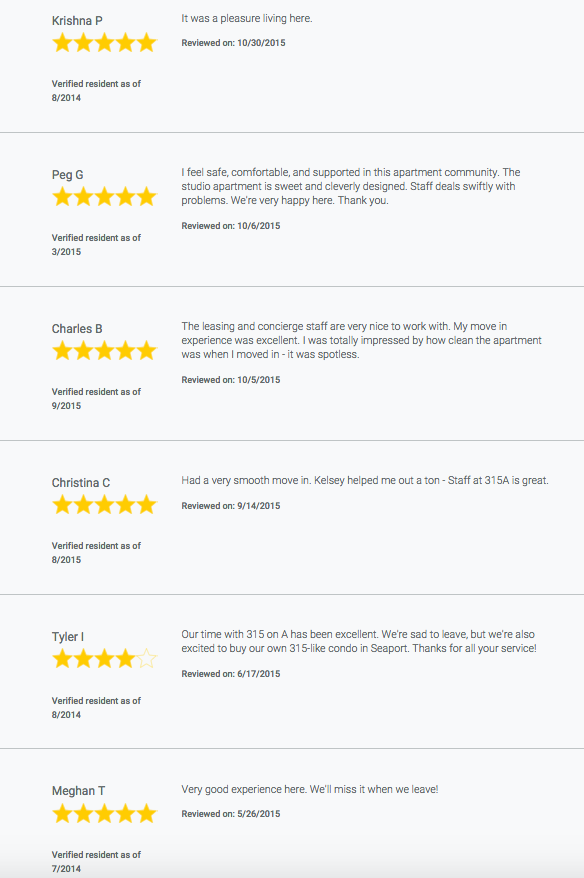
These listings are also verified, which means you can make sure (to a certain degree) you’re receiving fair and balanced reviews from real renters - something that’s not guaranteed by other review services like Yelp.
Brand reputation like this is an added bonus because you’ll be able to exert greater influence over what shows up in Google for your properties. According to the earlier Moz study, 3 negative articles could mean you’ll lose 59% of potential customers, while 4+ negative articles loses up to 70% of potential customers!
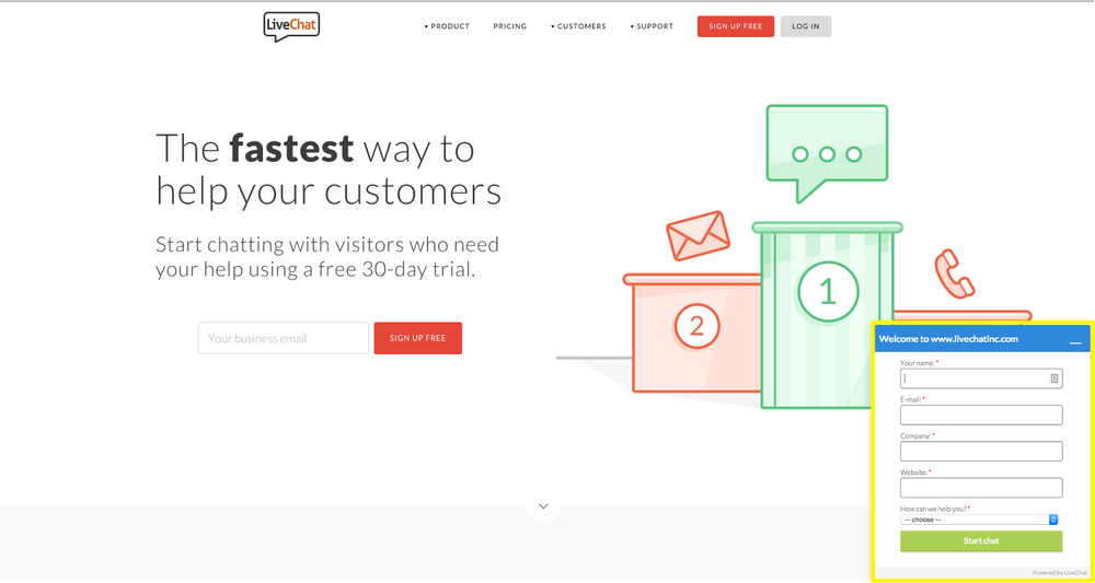
Live chats are popping up across websites for a simple reason: 91% of customers who use them are satisfied with the feature.
Forrester research also found that 44% of people said having a live chat while researching a purchase is one of the most important site features you could have.
The good news is that adding a live chat is a simple, painless process that can only take a few minutes to implement. Adding services like the appropriately named Live Chat to your site is as simple as copying and pasting a little code. Then you’ll get a little pop-up in the lower right of your screen.
Or you can do what Troy Boston has done, by incorporating a link into their main navigational menu (upper left of the screen).
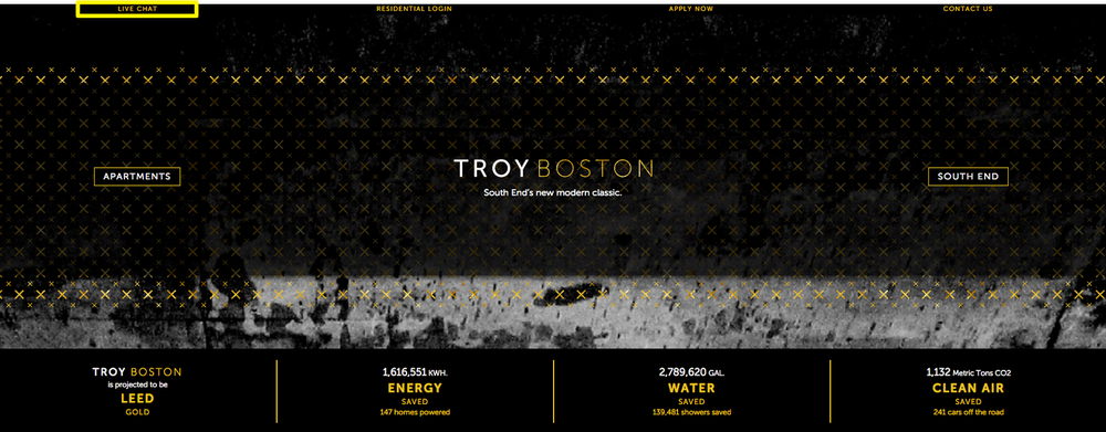
Click on that link, and a new tab opens with the live chat screen, ready for someone to help out. You can also randomly assign these across your team, so there’s no one person dedicated (and bombarded) with messages all day.
Consumer behavior has shifted to the point that almost every single renter will now research your property online before stopping by for the first time.
That can be a huge advantage if you’re tapping into some of the latest available technology to provide a rich, interactive experience for visitors who might arrive at your site in different ‘stages’ of awareness.
Some of these visitors will stop by to checkout your ‘unbranded’ content months in advance of needing a new place to live. Others will arrive and become interested through your photos, amenities and videos. And you’ll have a few prospects who will build desire through imagining themselves in a specific unit type before taking action by scheduling a property tour. Incorporating mobile responsiveness, user tracking, reviews and a live chat can put your property over the edge.
Many multifamily property websites have these features to one degree or another. But execution is the great differentiator which can set your property apart and help justify those premium rents.
Upgrading these critical site features not only gives you a better chance at success, but it also helps you avoid blending in with everyone else, forced to compete on price because value of your property doesn’t come across online.