

When most apartment marketers are tasked with increasing the number of leads they get from their website, the first thought is to get more traffic. More visitors equals more leads right? Not necessarily.
Instead of focusing on trying to get more people on your site, shift towards converting the ones that are already visiting. No matter how much traffic your site receives, it’s useless if it doesn’t convert.
If you want to get more leads from your site, follow these 7 tips for conversion rate optimization.
When people land on your site and see your lead generation form, do they feel compelled to take action? If not, the problem could be that you have a weak value proposition or don’t have one at all.
A value proposition answers the question “why should I rent from you?” If your answer is “because we have empty apartments” then that’s not going to set you apart from the dozens of other multifamily companies you’re competing with.
It’s not unusual for property management companies to overlook adding a value proposition to their site because they tend to focus on the product itself—the apartments. But a value proposition isn’t just about what you sell, it’s what makes you different from your competitors offering the same product.
Take a look at Greystar’s home page:
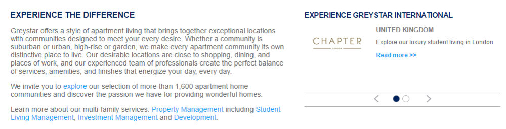
They’re making it clear that when you choose one of their properties you’re not getting a cookie cutter apartment. They also point out that they carefully choose their locations to make them convenient for renters.
You don’t need to have a laundry list of things that differentiate yourself from competitors. Just one “X” factor that would persuade a website visitor to take action instead of exiting out.
Did you know 96% of the people that visit your website aren’t ready to make a purchase? That means you’re already at a disadvantage the moment a visitor lands on your site. But here’s the thing. Your website’s job isn’t to get people to rent. That’s up to your leasing agent or property manager. Your website’s purpose is to get people to visit your property.
In order to entice people to fill out your contact form, you need to create a sense of urgency.
Aside from people trying to move in on short notice, most apartment hunters don’t rush to check out properties they find online. They may add it to their list of apartments to visit “eventually,” but they generally don’t see a website and immediately schedule a visit. That is, unless you persuade them to.
Creating a sense of urgency helps with your conversion rate optimization efforts because it compels people to take action now instead of putting it off.
One of the simplest ways to create a sense of urgency is to provide a promotional offer. When you visit Symphony Apartment’s website, you’re immediately shown a pop-up with a limited time offer.
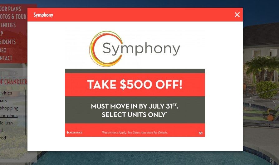
Notice that the deal has an expiration date. That’s vital because it gives people a deadline, which consumers have a tough time resisting. The fear of missing out on a good deal is more than enough to compel most people to take action when they otherwise would hold off.
People don’t like to fill out forms. Unfortunately it can be a hassle to complete the “schedule a tour” forms on some apartment websites. The end result is people giving up and leaving. Or worse, they see the form and immediately exit.
You may not think having a few extra fields on your contact form makes a difference, but data suggests otherwise. Hubspot analyzed over 40,000 landing pages and found that conversion rates dropped significantly when there were more than three fields to complete on a form.
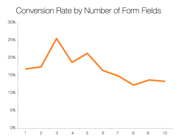
How many fields does your lead generation form have? If it’s more than four, you may want to consider scaling it back a bit.
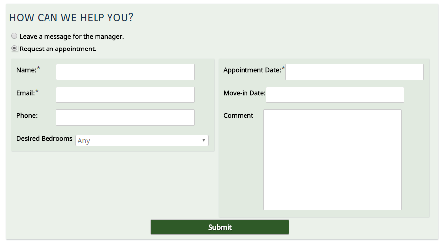
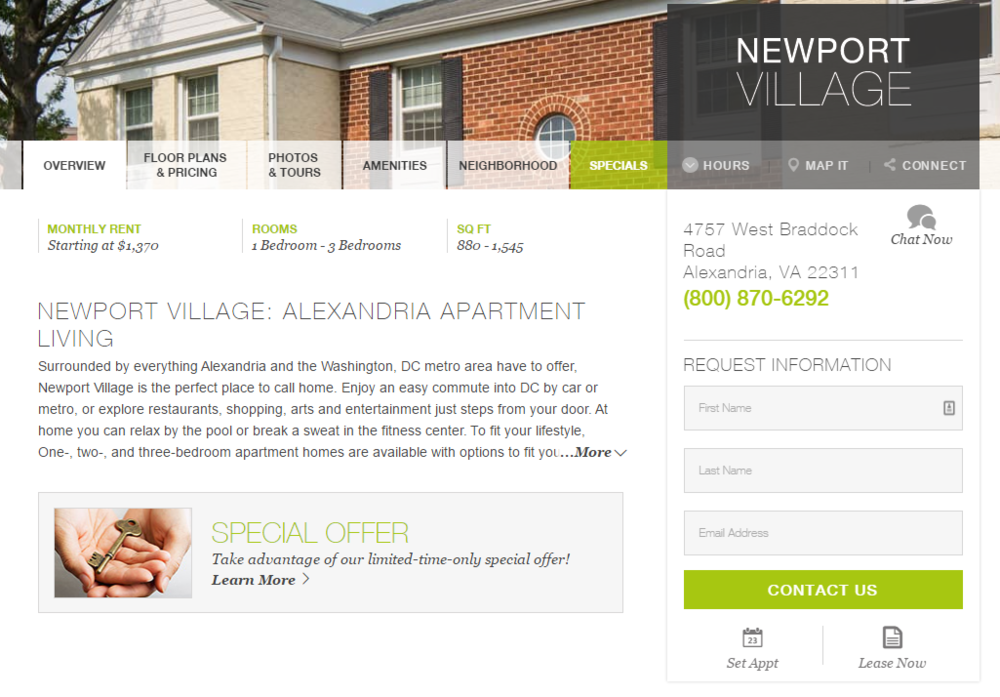
It’s not out of the norm for forms on apartment rental sites to have five or more fields:
However, UDR’s lead generation forms are a great example of a minimal approach that’s more likely to get people to take action due to its simplicity. There are only three fields to complete.
Another factor that could be hurting your conversions is the effort required to get to your contact form. When people land on your site, how many clicks does it take for them to get to a contact form? If it’s more than three or four, it may as well be hidden.
Like we mentioned earlier, a majority of the people that visit your site aren’t going to take any action. If your lead generation form is buried underneath apartment selector menus and floor plan pages, visitors are likely to get frustrated and leave. If possible, you should have a lead generation form on your home page.
Simplify your visitor’s experience and you’ll notice your conversion rate start to increase.
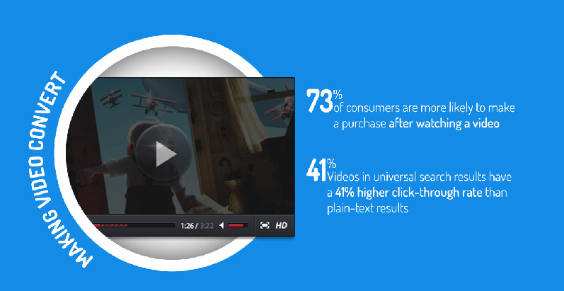
We’ve talked about the power of video marketing in our list of apartment marketing ideas, but did you know that videos can actually help your website convert better? According to Conversioner, 73% of consumers are more likely to make a purchase after watching a video.
You don’t need to hire an expensive video crew. Recording a high-quality video tour of your community to showcase your apartments and amenities will suffice.
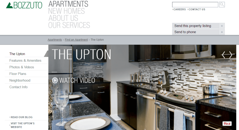
The Buzzuto Group does a fantastic job of including a video on the home page for the Upton Apartments. Clicking on “Watch Video” triggers a YouTube video to show up in a sleek unobtrusive light box.
Another example of the power of video is this case study for growyourowngroceries.com. By swapping out an image for a video, the website increased conversions by 12.62%.
Pretty much every marketer knows about the importance of A/B testing, yet some still don’t do it. In the past, running split test was a pain and required hiring experienced conversion rate specialists. But today there are plenty of great tools that make it easier than ever:
There are also apartment marketers who want to split test, but aren’t sure of what they should test. Some of the top elements of your website you should test are:
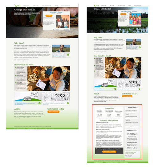
You should try to test almost everything you possibly can. That’s the only way to find out the optimal landing page design for your audience. Even the slightest tweak can cause a big shift in your conversions. Non-profit lending company Kiva added an information box to the bottom of a landing page and increased conversions by 11.5%
If you only do one thing on this list, it should be split testing!
Do you know the difference between Nike and Terrem? Most people have no idea what Terrem is and Nike has an established reputation. That doesn’t mean Terrem doesn’t sell quality shoes, but Nike’s rave reviews and millions of customers give them an advantage.
People make buying decisions based on trust. If a consumer doesn’t know or trust your brand, they’re less likely to buy from you. Increasing the trustworthiness of your website can capture leads that you’d otherwise lose out on.
So how do you earn trust?
The best way for apartment marketers is through social proof. That could mean video testimonials, social media shares or online reviews.
Studies show 70% of Americans seek the opinions of others before making buying decisions. The best copywriting in the world won’t help if your community has dozens of one-star reviews on Google and Yelp.
Gables Sugarloaf highlights their reviews on the homepage so visitors can see how other people feel about the community.
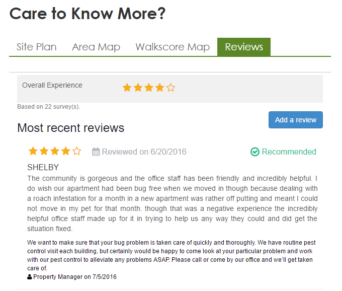
Show your website visitors that other people like you, and they’ll be more likely to follow suite.
It’s tempting to pack your website with tons of bells and whistles to help it be more interactive and eye-catching. But here’s the deal. The more elements you add to your site’s design, the more opportunities visitors have to be distracted. It can also slow down your website, which can absolutely ruin your conversion rate.
You want to get your traffic to take action. Everything else on your site is just icing on the cake. Some things that you can afford to leave off your home page are:
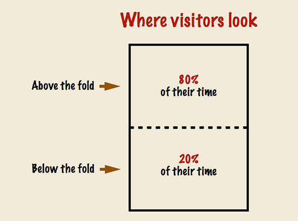
This is particularly important above the fold of your website. The content “above the fold” is anything a visitor can see on a web page without having to scroll down. Minimizing the elements you place above the fold is important because that’s where people spend most of their time on your site.
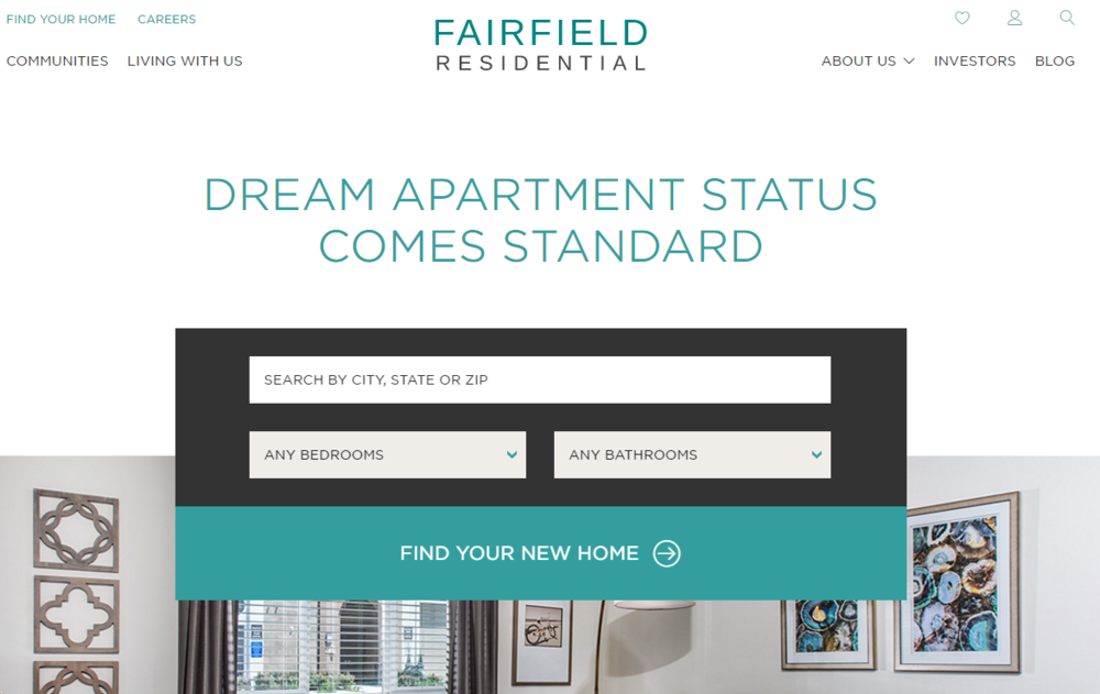
Fairfield Residential does a great job of making sure their main call to action is above the fold. Notice how it directs traffic to take a certain action.
If your website’s design is too busy and cumbersome, it could be dragging down your conversion rate.
The tips above could mean the difference between having a website built to convert and one that’s just for show. Turn your site into a lead generating machine by placing as much importance on conversion rate optimization as you do on getting traffic.
If you’re not getting the results you’d like from your website, contact us for a free consultation.