Whether you’re just getting started with Facebook Ads, or you just haven’t had the success you expected from your campaigns, a little inspiration never hurts. Looking through Facebook Ads examples is one of the best ways to get an idea of what you should aim for with your own campaigns.
Creating high converting ads isn’t as simple as finding a nice looking image and quickly writing a headline. There’s an art and science to Facebook Ads, and the advertisers who do it well make it look easy. By combining some of the general best practices of Facebook Ads (the science) and your creativity (the art) your ads have a much higher chance of succeeding.
Before jumping right in to our ad examples, let's start with some basics...
What Makes a Successful Facebook Ad?
You’ll notice some recurring themes and similarities between a lot of the Facebook Ads examples we’re going to show you. That’s because there are certain elements you need to focus on to make ads that are compelling enough to drive high click-through rates and convert viewers into leads.
Here are some of the most important elements of a well optimized Facebook ad.
Eye-Catching Visual
There’s a reason Facebook doesn’t have text-based ads like Google Adwords and some other advertising platforms. They understand the importance of visual content.
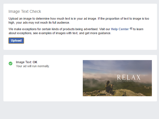
In fact, Facebook believes so firmly that people prefer ads with less text that they implemented their 20% text overlay rule back in April. The rule caused any ads with visuals containing more than 20% text to automatically be rejected. Although that rule will change soon, it doesn’t change the fact that your ad image shouldn’t be cluttered with text.
Use this tool to see whether or not your ad’s image has too much text.
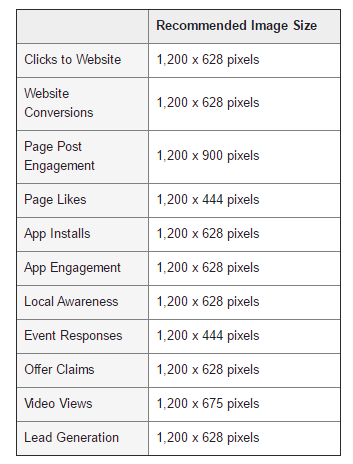
As for sizing, Facebook recommends 1200 x 628 px for most ad types.
Compelling Value Proposition
This is one of the most common steps marketers overlook when creating Facebook Ads. Your ad needs a value proposition.
A value proposition answers the question “what’s in it for me?” Since most people are automatically turned off by ads, your value proposition needs to be strong enough to overcome their natural objections to ads.
A strong value proposition is:
- More factual than subjective: “125 Five Star Yelp Reviews” vs. “The Best Apartments in New York”
- To the point: The viewer should immediately see the value they’ll get from clicking your ad.
- Too good to pass up: “Schedule your apartment tour today and save 20% off your first month’s rent!”
A Laser Targeted Audience
Facebook’s audience targeting is unrivaled. Since you know exactly who your ads will be shown to, it makes it easier to personalize your copy and visual to match your ideal prospect.
The ad you create for 21-34 year old females should be different than the one you make for 50-60 year old males. Even if it’s for the exact same product.
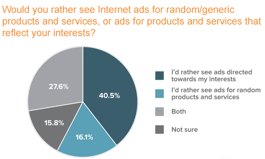
The more relevant your ads are, the higher your CTR will be because most people don’t click on ads that are irrelevant to them. A survey from Zogby Analytics found that 40.5% of adults in the U.S. prefer ads directed towards their interests, while 27% preferred a mix of targeted and non-targeted ads.
Make sure your ads match their intended audience.
Clear Call to Action
Your CTA is what will push viewers to actually click your ad. The value proposition gets them interested, but your CTA is the finisher.
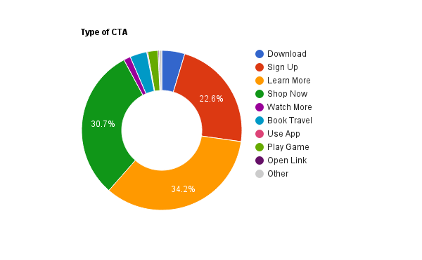
AdEspresso analyzed over 37,000 Facebook Ads and found most advertisers aren’t utilizing CTA buttons provided by Facebook Ads enough. Here’s a breakdown of the buttons that are used the most.
Your CTA isn’t just limited to what’s provided by Facebook. You can also add a CTA into your copy. For instance, “Limited units available. Click here to schedule your apartment tour today or regret it tomorrow!”
Appeal to an Emotion
Robert Plutchik is famous for creating the wheel of emotions. The diagram represents the eight basic emotions we all have.
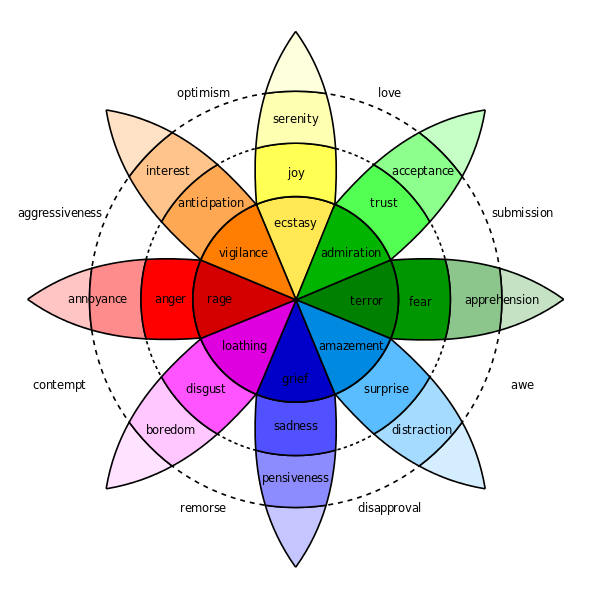
Targeting these emotions with your Facebook Ads will motivate people to take action based on the feelings they get from them. Think about the last ad you saw that really affected you (negatively or positively). There’s a strong chance you can trace it back to one of the emotions above.
Now that we know some of the elements of a great ad, let’s take a look at some Facebook Ads example and break down why they work.
Desktop Newsfeed Ads
1. GoDaddy
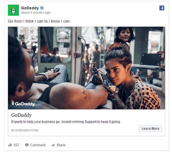
Why this ad works:
- Brief: There’s not a lot of text in the ad. They were able to get their message across without using hundreds of characters.
- Targeted: This ad is targeting small business owners in India. Everything from the people in the visual to the landing page is highly targeted to a distinct demographic.
- Branding: The entire ad is filled with GoDaddy’s branding, which is a reputable brand.
- Social proof: They point out that they’re an award winning company, which helps reassure customers.
- Emotional appeal: This is a very inspirational ad. The headline oozes motivation which is right in line with GoDaddy’s target audience of entrepreneurs.
2. State Farm
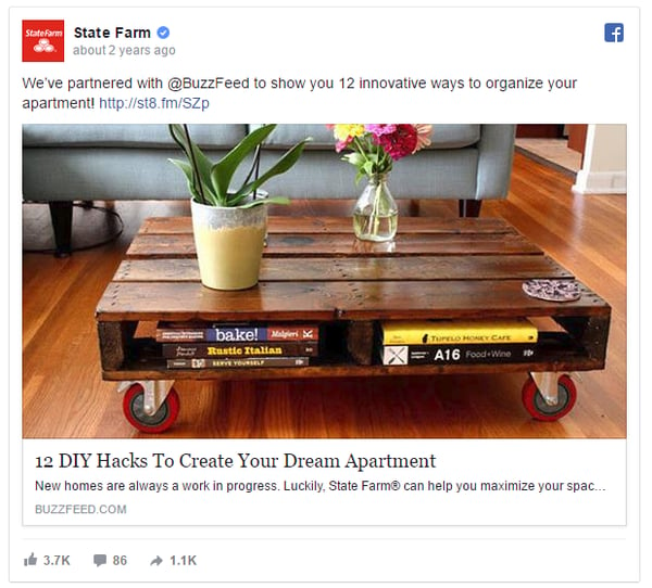
Why this ad works:
- Value Proposition: When you click this ad, you know you’re getting ideas on how to organize your apartment. Plus, in the description, they state that it’ll help you maximize your space.
- Great visual: The image of a creative DIY coffee table gives readers an idea of the type of content they can expect from the post.
- Co-branded: State Farm is a well-known company, but they also mention they teamed up with Buzzfeed which is a company with a lot of social media clout.
- Targeted: The ad is clearly targeting “trendy” people looking to give their apartments a fresh look. If we were to get a look at the audience targeting, I’m sure the demographics skew towards young adults.
Mobile Newsfeed Ads
3. Trunk Club
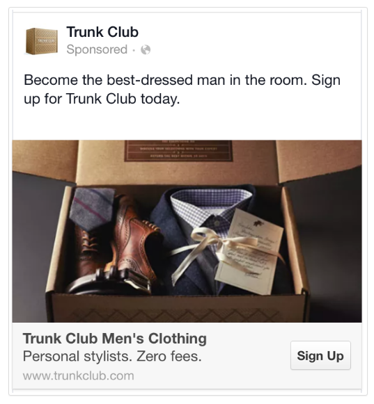
Why this ad works:
- Benefits galore: This ad is filled with value propositions. “Become the best-dressed man in the room” and “Personal stylists. Zero fees.” are enticing enough to get you to click-through.
- Shows the product: The image shows what the product looks like, which makes viewers want to click to see more information about what they can get.
- CTA: There’s a CTA in the headline, as well as the sign-up button. Trunk Club is making it clear what they want users to do.
- Brief: Since this is a mobile ad, there isn’t a lot of room for unnecessary words. They’ve done a great job at getting straight to the point.
4. Breather
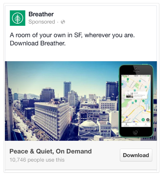
Why this ad works:
- Targeted: The ad is geographically targeted to people in San Francisco rather than promoting the app to everyone.
- Value proposition: The ability to get a room wherever you are in the city is convenient, which is a huge selling point of any type of rental service. Plus the promise of peace and quiet is always nice!
- The right CTA: Since this is an app, the download button is the perfect CTA. As you saw in the chart earlier, most companies default to the “learn more” button, but the key is to tailor your CTA to your ad.
- Social proof: Knowing over 10,000 people have already downloaded the app gives it more credibility.
Sidebar Ads
5. HomeSuite
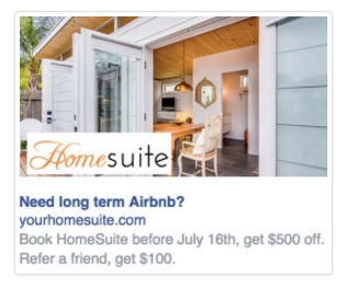
Why this ad works:
- Sparks interest: By using a question in the headline, it gets people curious to learn more. Questions are a great way to immediately capture your viewer’s attention.
- Value proposition: They’re offering a discount plus the ability to make money by referring a friend.
- Deadline: By setting a deadline, they’re urging people to take action right now instead of putting it off for later.
- Using familiar brands: The viewers may not be aware of what HomeSuite is, so they mention Airbnb to add familiarity and to paint a clearer picture of the services they offer.
6. Airbnb
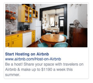
Why this ad works:
- Immediate CTA: The headline functions as a CTA by telling people to “start hosting on Airbnb.”
- Uses numbers: Using a less common number like $1190 instead of $1200 piques a viewer’s curiosity because it’s so specific it stands out more.
- Value proposition: The offer of money is always a great value proposition.
- Specific service: Airbnb is a two-fold service. They target renters and people looking to rent out their space. Instead of trying to target both audiences in one ad, they divided it up.
Video Ads
7. iHeartDogs
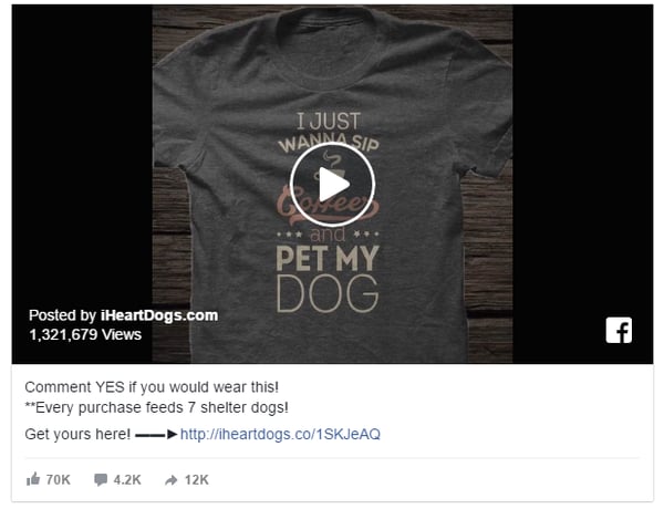
Why this ad works:
- Asks for engagement: By taking the step of asking people to leave a comment, iHeartDogs was able to drive massive engagement.
- Consciousness: Conscious capitalism has become extremely popular recently because people like to support a good cause. This ad lets viewers know how their purchase benefits someone else, giving it strong emotional appeal.
- Social proof: As more people viewed, shared and commented on the video, the stats kept moving up. This snowball effect created social proof that kept the momentum going.
- Simple CTA: The ad is for a specific product, and the CTA makes it easy for people to get that exact shirt from the video. The easier you make the process, the better your conversions will be.
8. Monster Energy
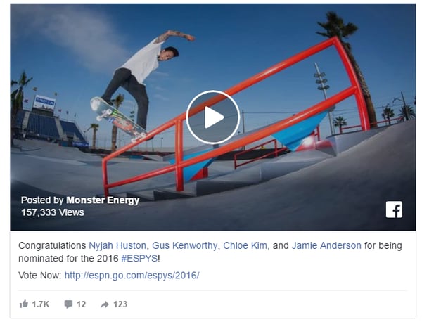
Why this ad works:
- Eye-catching thumbnail: These ads appear in users’ newsfeeds. The thumbnail is eye-catching enough to stop people from scrolling past it.
- Mentions influencers: By mentioning a handful of influencers, Monster is able to appeal to each of their individual fan bases.
- Current event: The ad was for the ESPYS awards show, which allowed them to "trend-jack" a popular topic.
- Controversial: Any time you have a passionate group of people voting on something, there’s going to be some controversy. Pitting the different athletes against each other entices people to share the post with their friends so they can debate about who should win.
Events Ads
9. Quicket
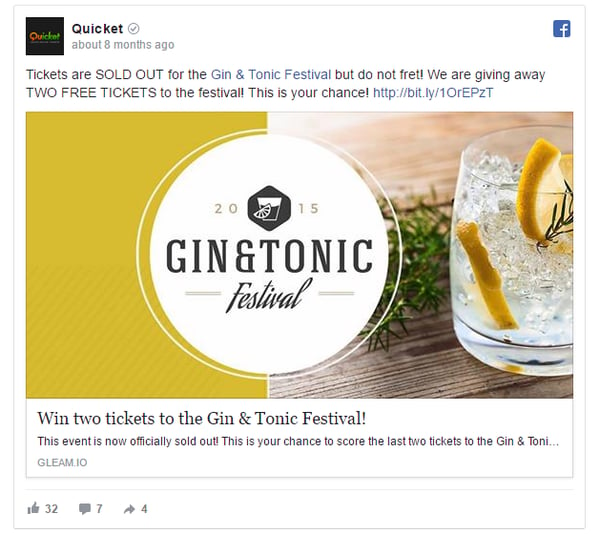
Why this ad works:
- Scarcity: The ad starts out by saying the event is sold out. But they highlight there are only two tickets left which creates the fear of missing out (FOMO).
- Vibrant: The visual uses yellow and white, which stands out on Facebook’s blue and grey color scheme.
- CTA: Even without a CTA button, the sense of urgency created by saying there are only two tickets available urges people to take action.
10. Savage Race
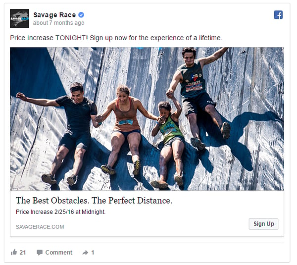
Why this ad works:
- Energetic: The image is filled with excitement, energy and looks fun. It captures the “feel” of the event.
- Sense of urgency: The ad points out the price of the event will increase tonight, which compels viewers to take advantage right now.
- Value proposition: The picture and copy do a great job of conveying how fun and exciting the event will be.
- Excludes the price: The ad builds up excitement for the event, but purposely leaves out an important piece of information—the price. That forces viewers to click the ad to find out more.
Use the 10 examples above to help you craft better Facebook Ads for your business. Remember to test different variations to find what works and what doesn’t.